Block 1 consists of the following activities:
Two image editing activities
An audio editing activity
Project 1
Image effect 1
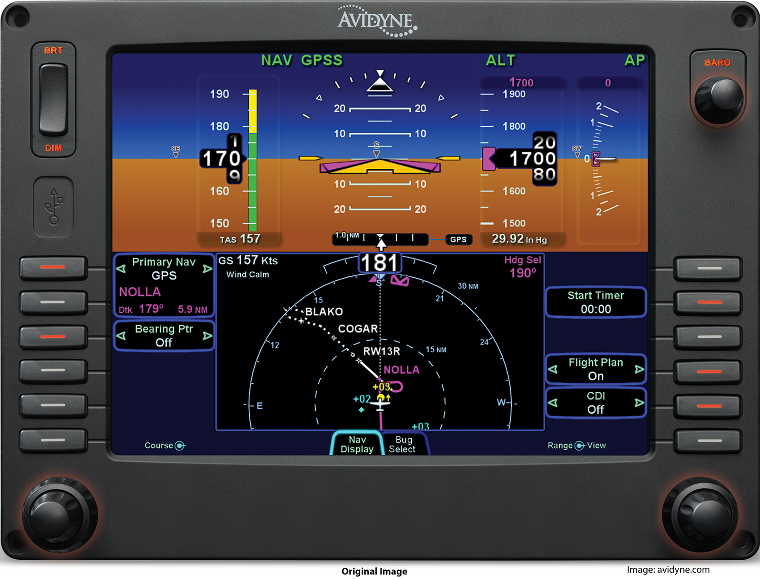
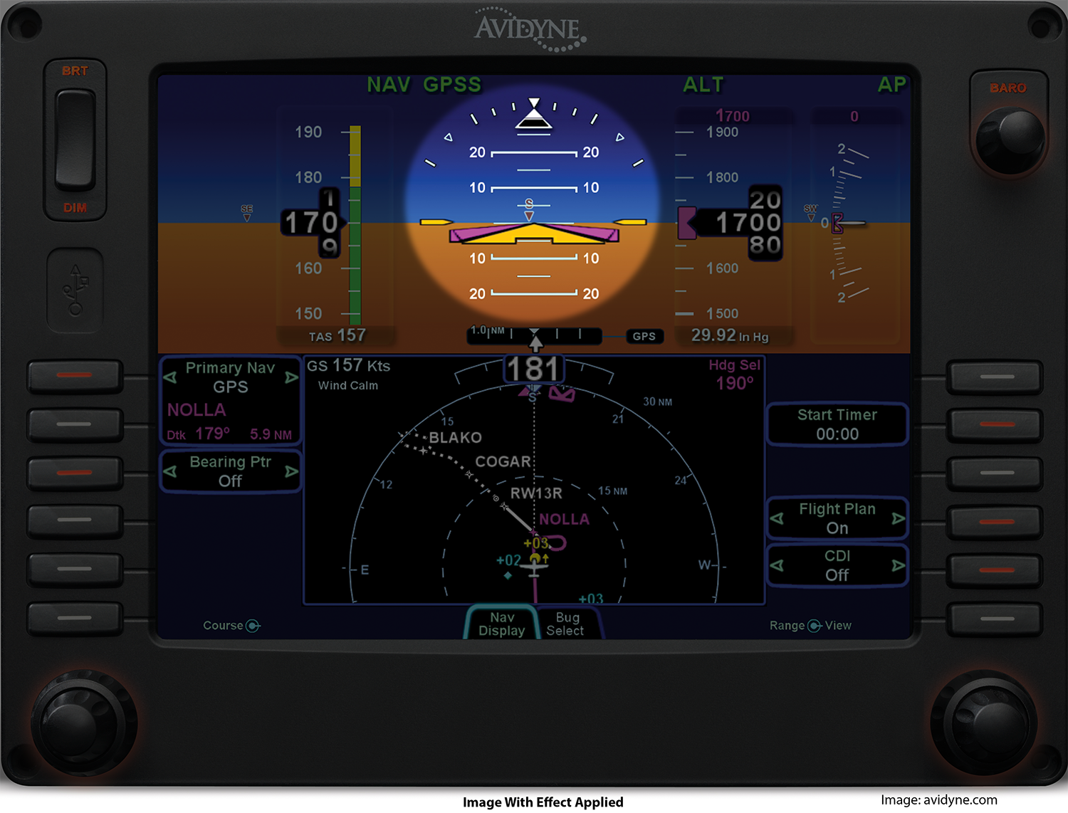
Below are two images of the Avidyne PFD4000 primary flight display. The image on the left is the original. I added the words “original image” and “image with effect applied” along with the image source information, using Photoshop’s text feature. The image on the right is the modified image with an area highlight effect. It highlights the area known as the “Attitude Indicator.” This process was done in Adobe Photoshop CC (2015) and I downloaded the action effect from the website, Creative Bloq. The action allows a user to quickly create a task that is repetitive, such as highlighting and I have never used the any action function prior to this activity. It is very refreshing that the workflow can be streamlined without having to build an older style macro, although it is very similar.
Basically to use this tool, you open open the Actions panel, scroll down until you find, Highlight, select it. Then, go to the toolbar and choose either the Rectangular, or Elliptical Marquee tool. Then draw the tool around the area you wish to highlight. After the area(s) are chosen, simply press the “play” button in the Actions panel. It is that simple.
Both images were resized in Photoshop in order to fit the webpage and still maintain detail when enlarged. The original size of the images was 3812 X 2903 pixels, while the reduced size dimensions are 1500 x 1142 pixels. The resolution of both images is 300 pixels/inch.
NOTE: the images may be enlarged by clicking on them.
Image effect 2
In the second image activity, I decided to work with 3D, something of which I don’t know really anything about. So, I was amazed with what Photoshop can do with 3D.
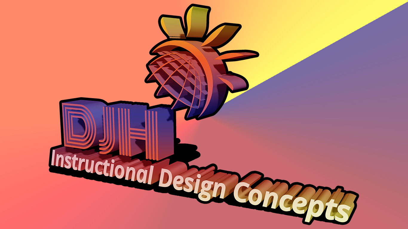
The original image (left) is my logo it looks okay for the most purposes but I wanted to try something different. What would happen if I convert it to 3D? So, after playing with various angles, I found one I liked. However, the colors were rather bland, of course the original colors were there, but it was the 3D colors that were bland -gray or rather, more like charcoal. I had no clue how to change them, so I continued play around with the options. I finally discovered the options “stroke” and “gradient overlay.”
The stroke option allows for adding color around the parameter of the the image a slider can expand or reduce the amount of color surrounding the graphic thus, creating a different look. Gradient overlay, can color the entire graphic and since it is a gradient you can add multiple colors and change the pattern of the gradient. I chose “soft-light” with an opacity of 100 percent. Additionally, I used a the reflective option and checked the “align with layer” box. The angle was set at 90 degrees, with a scale of 100 percent. After I completed it, I realized when I uploaded it, the web page gave it a white background. It looked sterile so, I went back to Photoshop to create a custom background.
The background I created by starting with a solid colored layer that was close to one of the colors in the graphic. I then applied a gradient and changed the angle to create the cool effect of appearing to emanate from the radiance of the Sun that is peaking up over the globe. I did not use any tutorials for this activity. Rather, I experimented with “trial and error.” until I found what I was looking for, and the desired effects.
Audio Clip Activity
The objective of the audio activity is to combine two sound clips and to create one sound file. I created a fictional module introduction for an aircraft instrument course. I then added a remix of part of the song from Naked Eyes, entitled “Voices in my Head.” The clip is copyrighted 1983, by Naked Eyes and the audio segment is used only for educational purposes. I believe it conforms to Fair Use as defined by copyright law.
The entire project was edited, mixed, and mixed down to two-track .mp3 format using Adobe Audition. First, I created the background music by editing the original file and and rearranging it to fit my needs. Second, I added the audio voice track and timed it so that there would be a music intro which then fades down and under the vocal track before returning to the previous level at the end. Once this was done, I mixed the multi-track session down to two tracks and converted it to .mp3 format for uploading to the website, Block 1 page.
Project 1
For Project 1 I chose to use Techsmith’s Camtasia 2. While this software is not as advanced as Adobe Premier or Final Cut Pro, it is a very versatile application. In addition, I have noticed that many IDT positions want the instructional designer to have experience in using Camtasia. So, I thought I would give it a whirl. I used Techsmith’s tutorials located at: https://www.techsmith.com/tutorial-camtasia-mac-current.html
My project consists of a fictional learning module dealing with flight instruments. The idea is that the course is designed to help pilots or student pilots, transition from the older analog instruments to the digital glass display (i.e., a computer and monitors) found in many, if not most, newer aircraft.
For this project I used Mayer’s fourth principle — Spatial Contiguity Principle, which states that the closer words and images are to each other, the easier it is for learners to comprehend the information; while the farther they are apart, the harder it is for learners to comprehend. In other words, If words and their associated graphics or images are farther apart, learners must hold the first set of information in short-term memory longer than if they could process the information together with the images or other graphics.
In order to create the video, I first assembled the images, which I had pre-set using Photoshop, that I was going to use. Next, I placed them into the timelines (tracks) and spaced them out to one minute. I then ran the timeline and began to determine which effects I would add. I ended up using more formal transitions since my target audience would most likely be older seasoned pilots or adult aviation students. Once the transitions were added, I reviewed the timeline again to check for smoothness between images. It was at this point that I decided to add my logo into the mix, and it added a nice touch.
The next stage was to review and size all of my images, as needed, to make sure they matched. Then I added the text to the images. This was done in Camtasia and not Photoshop. Now it was time to script and record the audio.
Adobe Audition is one of the best applications to use for audio of this sort, and the reason is that it allows quick access to either a stereo or mono track without defaulting to “multi-track” mode. The important thing about the script and the audio is that in the final assembly, all of the other content will revolve around the audio. In other words, all of the video clips will be synchronized to match the audio. However, before that was done, I edited the audio removing extra noises; I also added de-essing and noise reduction thus, creating a more professional sounding audio file. I then saved the file in both .wav and .mp3 formats. The .mp3 was imported into Camtasia and the .wav was filed for future/archival purposes. After the final assembly and tweaking, I exported the finished product to .mp4 format in 1080p and uploaded to Vimeo, where I then embedded it into my webpage.
Image sources used in the video:
Analog instruments: wikipedia.com
Avidyne PFD 4000: avidyne.com
Attitude Indicator inset: wikipedia.com
