Logo Introduction
Since I have already displayed my logo, I thought I would add to the assignment by showing and explaining the evolution from its initial design to the current one. I even added a future one, into the mix.
The Evolution of My Logo
When I created the foundation for my logo, I wanted something more than just my initials. I wanted something that could convey personal ownership and identify the field I work in. Thus, “DJH Instructional Design Concepts” was born. However, like many company logos and trademarks, I would soon begin experimenting with different looks, as I soon tired of words alone, I wanted something more. So, over the course of a year, my logo evolved to the current design. Whether I keep this logo after graduation is unknown. Still, I am content with it and I think it looks very professional.
The Early "DJH Instructional Design Concepts" Logo Prototypes
The first design was created in Microsoft Word. I used it, as I often do, to create prototypes of layouts. However, when I tried to replicate it in Adobe Photoshop, I ran into some problems that caused me to abandon the scheme. The next 4 prototypes were created using Photoshop. The the first one in this group is actually a smaller version of the second one. However, I didn’t like how they appeared one the webpage so I added a background, as shown in the third and fourth prototypes.
While the backgrounds appear almost black, they are actually a deep violet, which was a throwback to the website I created in my web design class. The idea was to create what looks almost as though the letters had just been pulled from a forge and thus, were still fiery hot with blue flame elements. While not overly apparent in the third prototype, it is a little clearer in the fourth one. Regardless, they didn’t look right to me on my new site, with its green and black color scheme.


The First "Global Sun" Design Prototype
Since I am an instructional design student and not a full-fledged graphic artist, I sought out a way to create a better logo from one of those do-it-yourself graphic design sites. These websites, for a small fee, will allow you to design your own logo using their tools and graphics, thus the “Global Sun” prototype was born.
I spent hours browsing through they different design until I finally found the one I liked -The sun peeking over the globe. The idea here was that it would symbolize my dawn into a new career and hopefully, the dawn of my contribution to the instructional design industry.
So, in this prototype we seen the new “Global Sun.” However, what I didn’t like about it was that my initials were too small and it seemed, to me, that the letters were lost, or perhaps, overpowered by the globe and sun. I also didn’t like the Fonts. So, this prototype was never used.
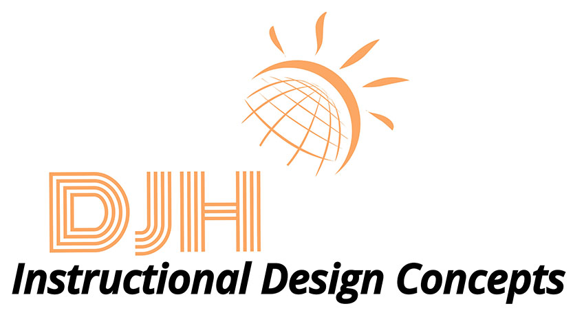
The Current "Global Sun" Design
I went back to the website I used to create the previous design and spent another couple of hours look at, and trying different fonts and various placements. Finally, I arrived at the current logo of the Global Sun design. I like it. It’s clean and crisp, not too flashy, and conveys a professional image. Yes, this one will work.
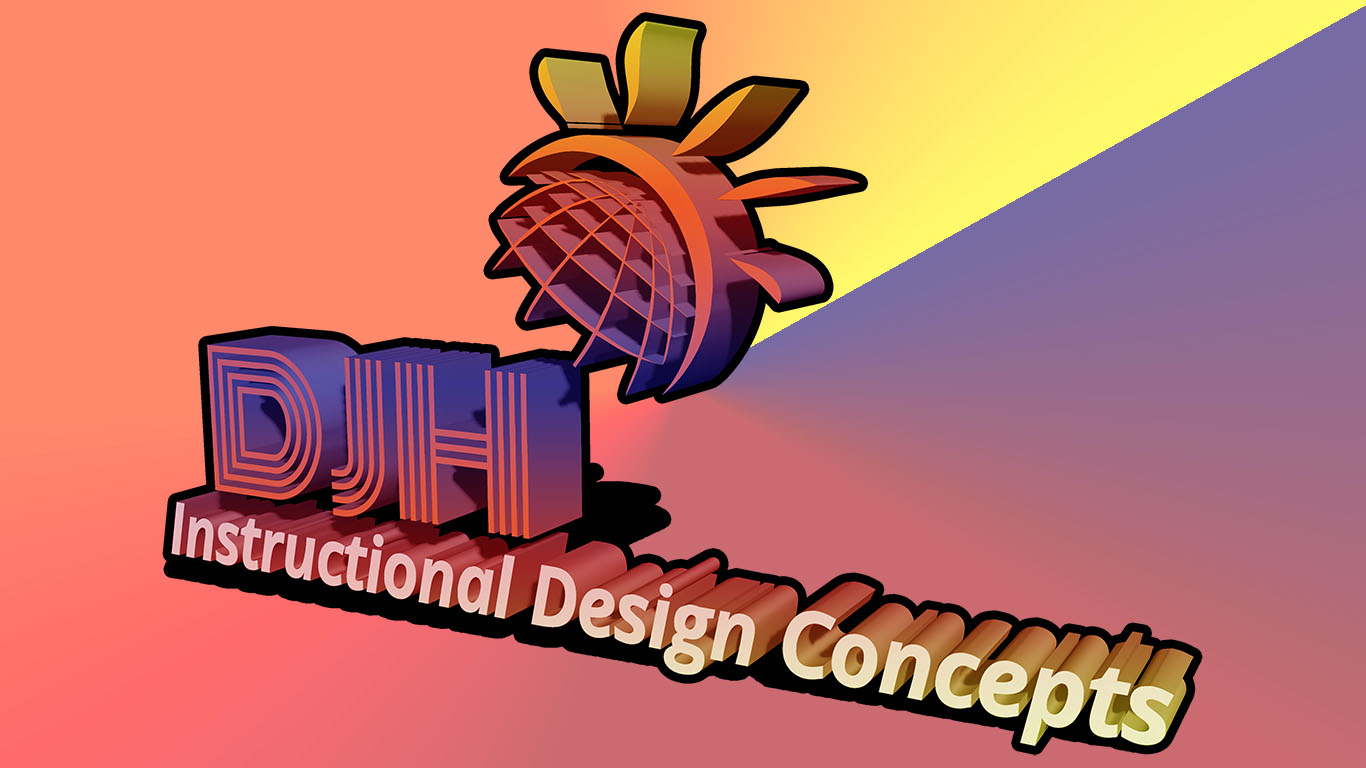
A 3D Variant of the Current Design
Here, we have a 3D variant of the current logo (see Block 1 for details). While I like this look, it is a little too much for all intents and purposes. However, under the right conditions it could work for certain applications.
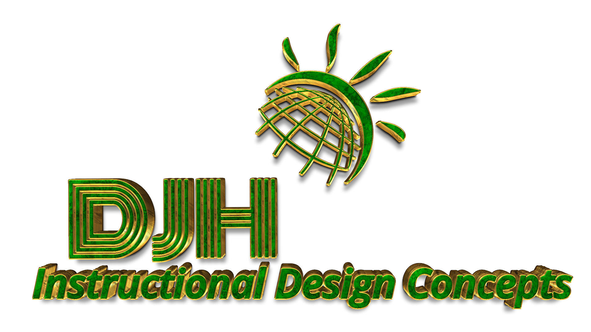
A Future "Global Sun" Design Prototype?
What does the future hold for my logo? Well, as stated earlier, I don’t know that I would actually use this name and logo on a professional scale. Having said that, I have also not ruled it out. Thus, I wondered what it would look like if an actual graphic artist had some fun with it. I decided to contact one, and for a small fee, they modified my existing logo and converted it into a 3D gold metallic and green marble logo. Nice! However, I would have it refined if I were going to use it. While it looks nice in large format, such as for a presentation slide, it is too small on my website, and the elements almost get lost. Still, if I decide to keep it, I might use it in the future for some professional project.